Social enterprises are businesses of the future. It is the next step to reinvent our economy, communities, and ourselves. SEN aims to bring those businesses closer to potential customers and encourage collaboration. Our brand will represent values that social enterprises share: it is bold, brave, inclusive, and makes us believe that a better world is just one click away.
The main brand colours were chosen in line with colour theory. Each colour represents values which are important for SEN, such as happiness, optimism, growth, generosity, power, renovation, nurture, nostalgia, playfulness, and trust. Creating multicolour branding sends the message of joy, creativity, and positivity.
The set of shapes on the left can complement the brand across multiple social media platforms and merchandise, proving useful when creating marketing assets. It can be manipulated in countless ways to create effective templates.
Logomark can be used on a variety of colourful backgrounds, whilst keeping a strong graphic form and standing out. The simplicity of it makes it possible to use on a variety of materials, like stationery, merchandise, and a website, without the risk of being in an aesthetic conflict with its surroundings.
The logo of our brand is simple, graphic and can be used on a variety of platforms in an effective way. The increasing shape of the symbols represents the dynamic growth of social enterprises and the growing effect on shaping the future. The colours represent happiness, positivity, optimism, trust, nurture, and playfulness.
Organising a contest for SE of the Year could increase engagement and provide a great opportunity for promoting the platform. By awarding businesses with this badge, we can improve their presence online and increase the feeling of pride in potential customers - for supporting social enterprises and for being a part of the future.
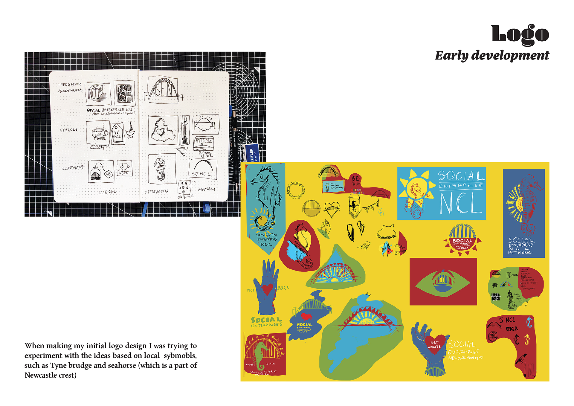
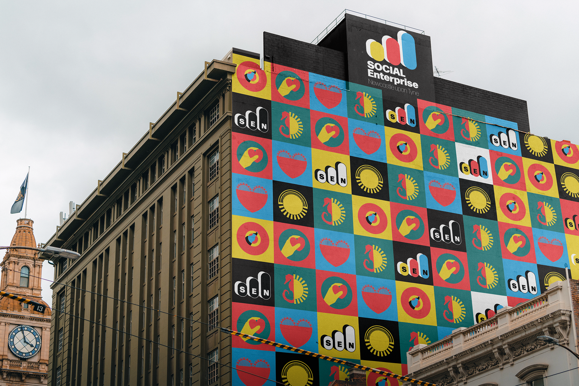
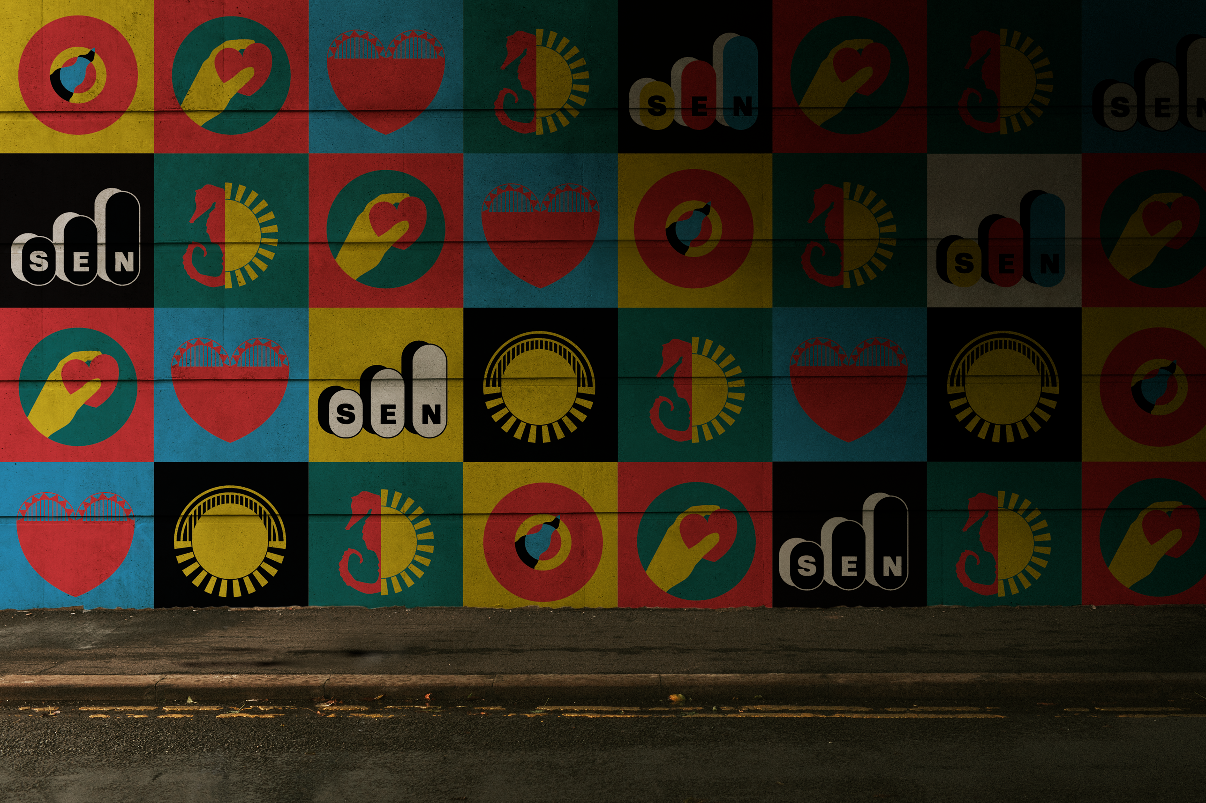
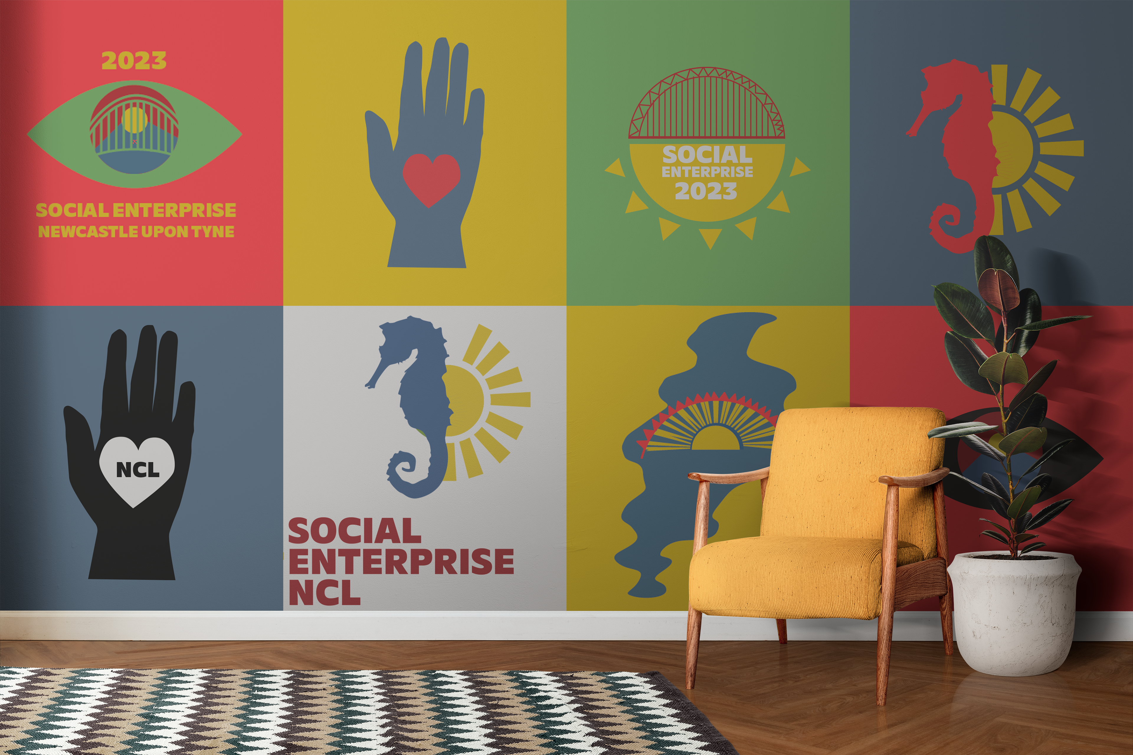
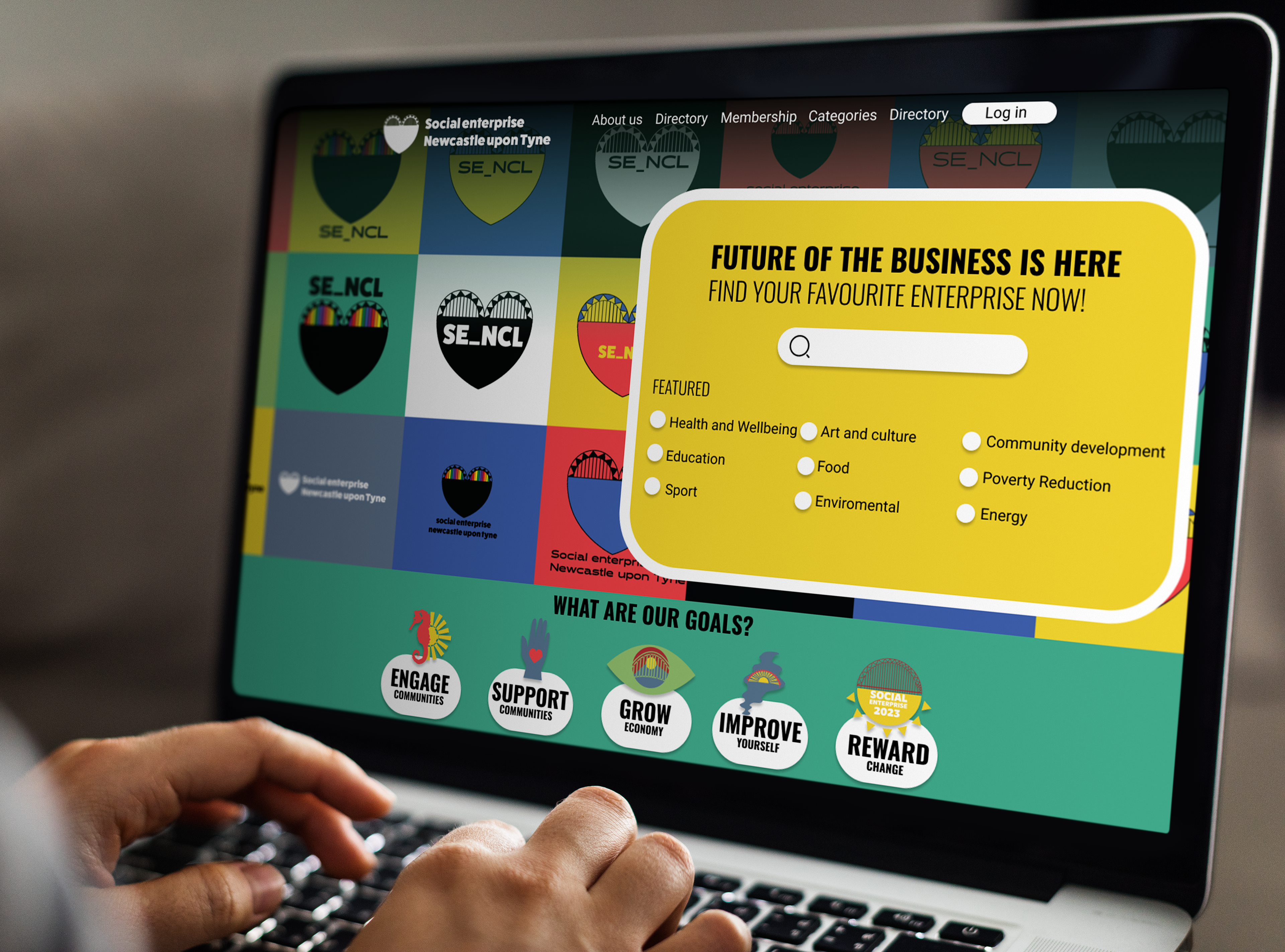
Each icon represents different values of the brand. The illustrations themselves symbolise different aspects important to the brand’s identity - The Tyne Bridge, the seahorse (which appears in town visual language since they’ve been put on Newcastle’s crest), the River Tyne, a heart symbol and an eye (focus).
Each icon can be used depending on what value we intend to highlight. The pattern can be used for marketing purposes, social media backgrounds, and merchandise. It speaks loudly that Social Enterprise Newcastle is a bold, fast-evolving brand representing the voice of positive change.
These patterns can be used in a variety of ways and can be manipulated to suit a variety of marketing purposes. The repetitiveness of the brand’s iconography can lead to grounding the brand in the consciousness of the local community and businesses. By portraying the SEN brand in a repetitive fashion i.e. in a pattern, it also allows the brand to be represented in a simplistic and effective manner.
UX conxepts
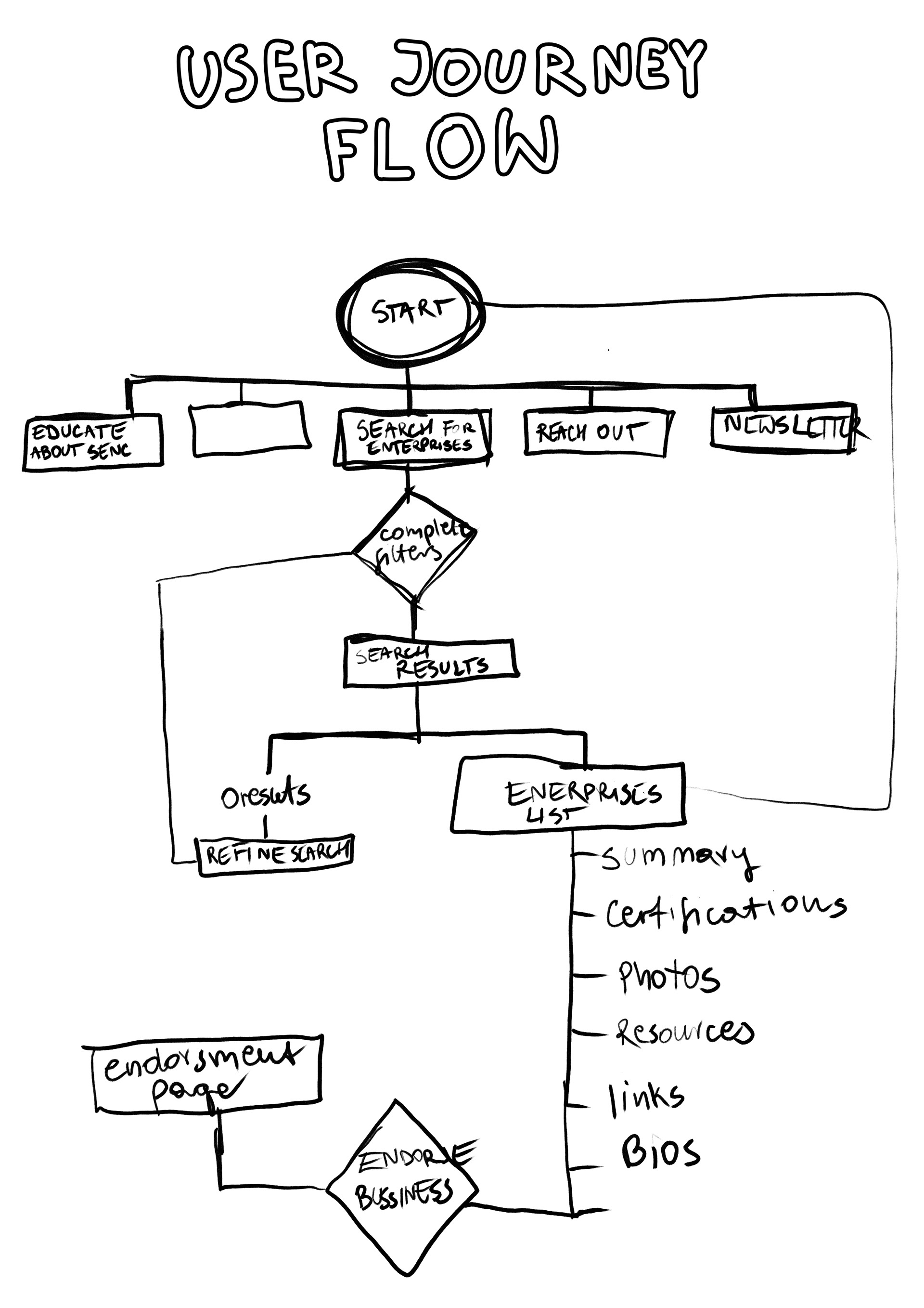
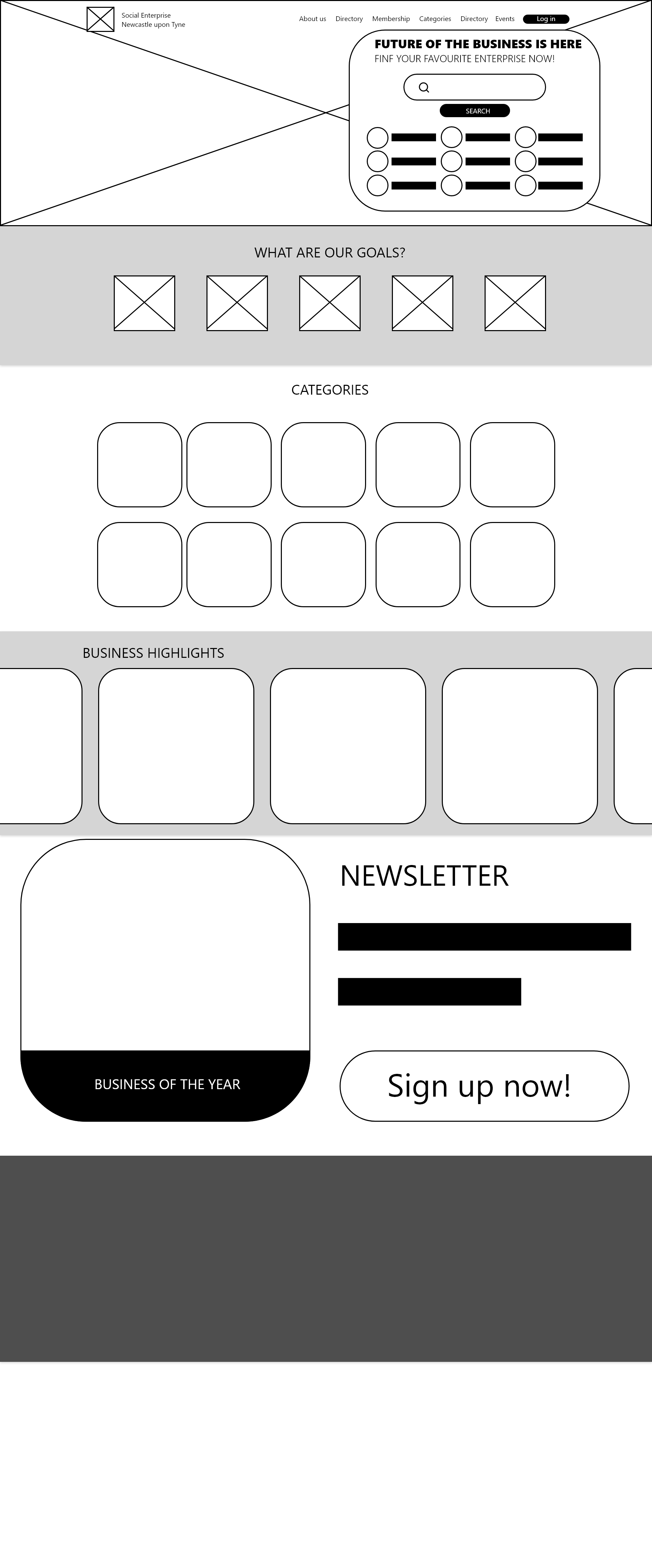

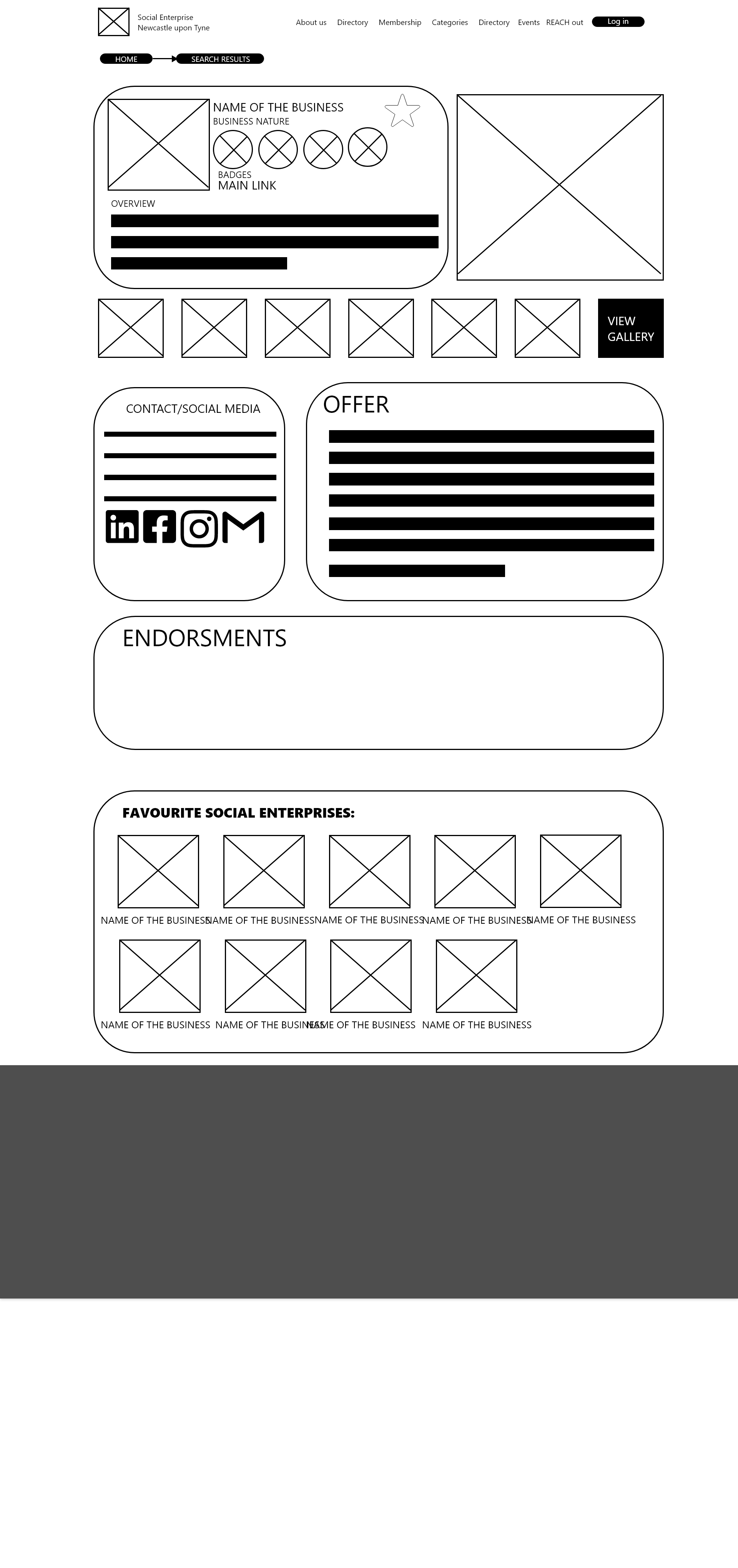
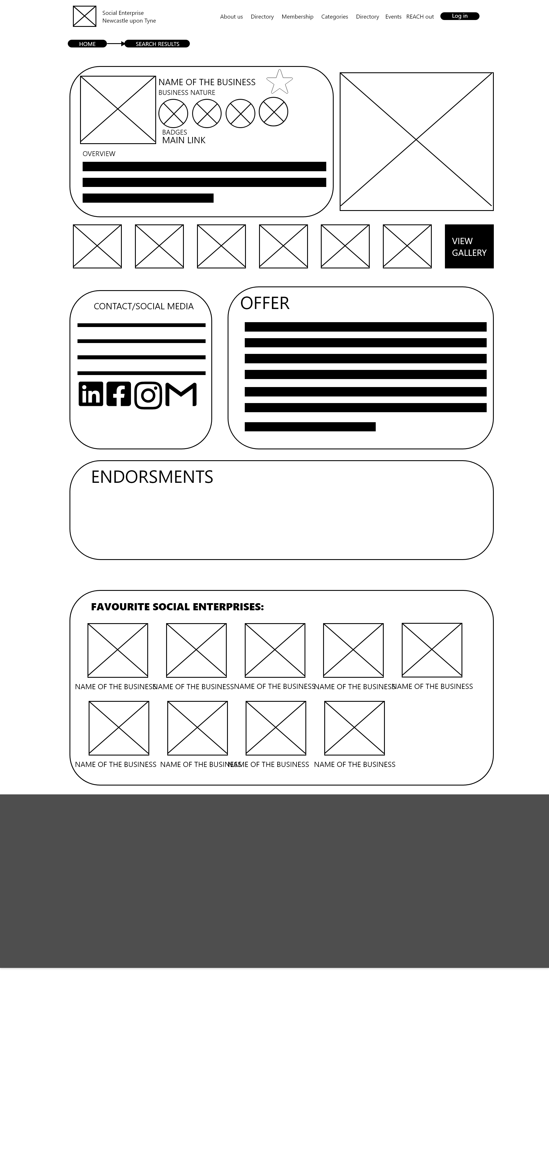
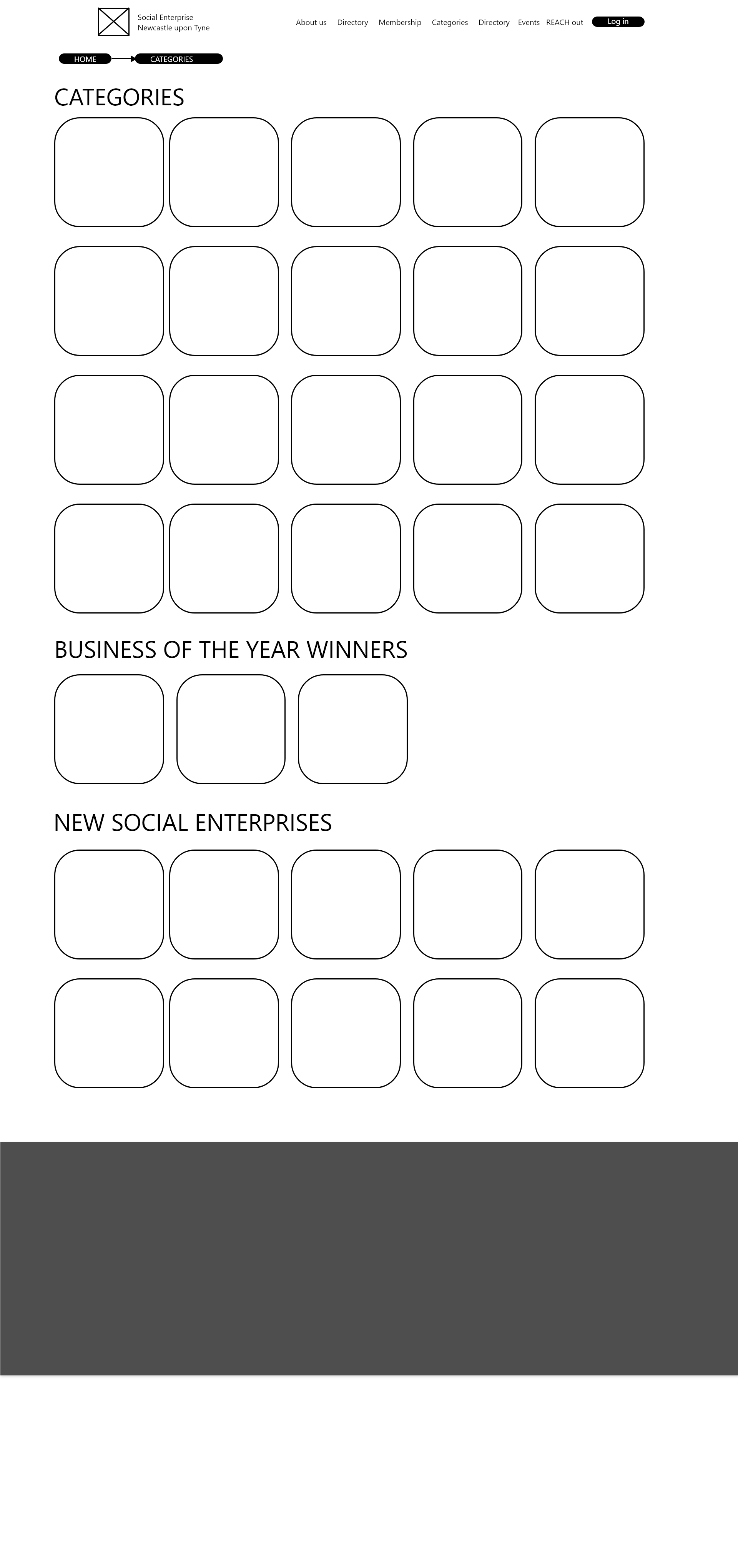
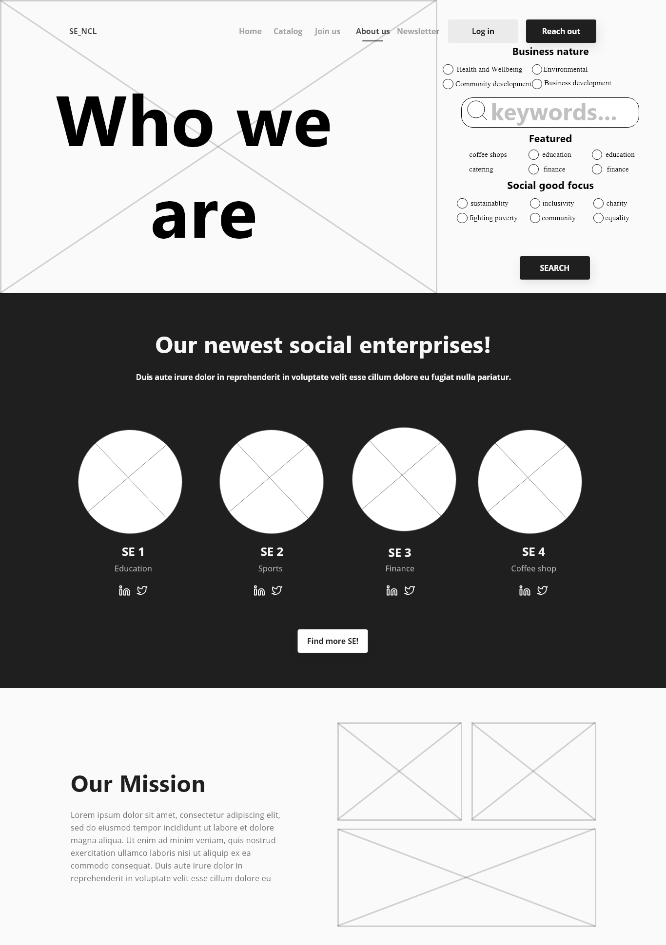
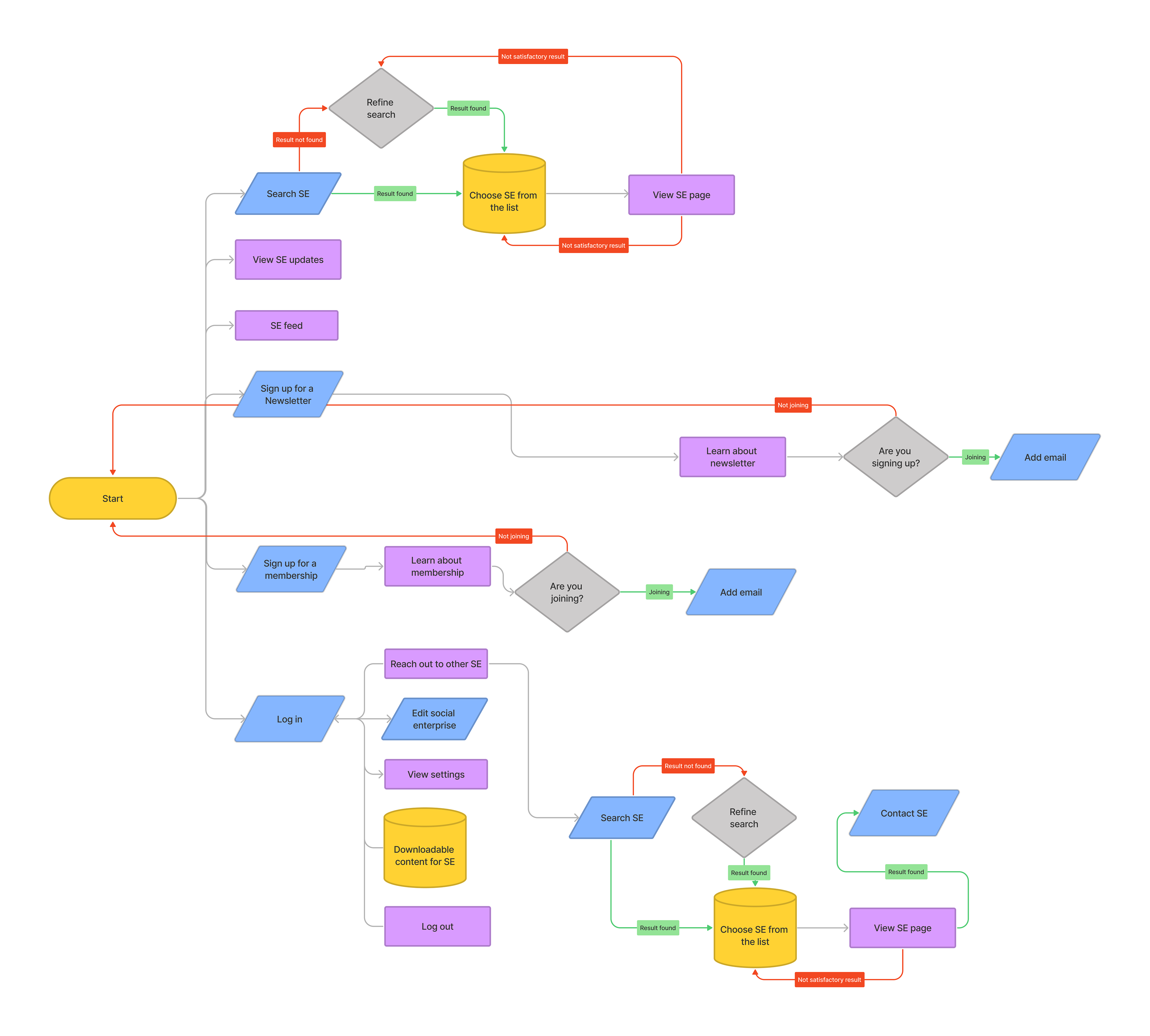
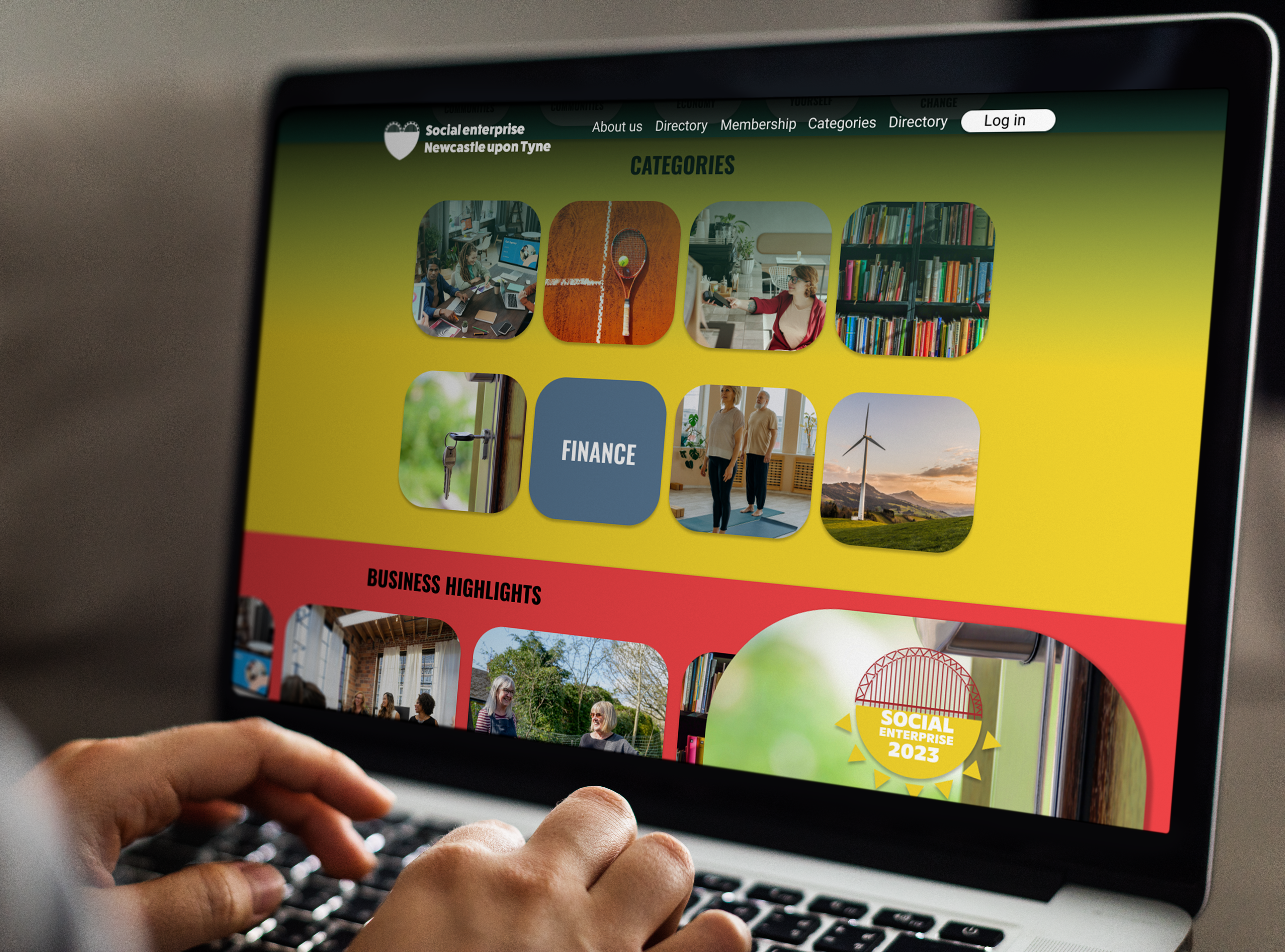
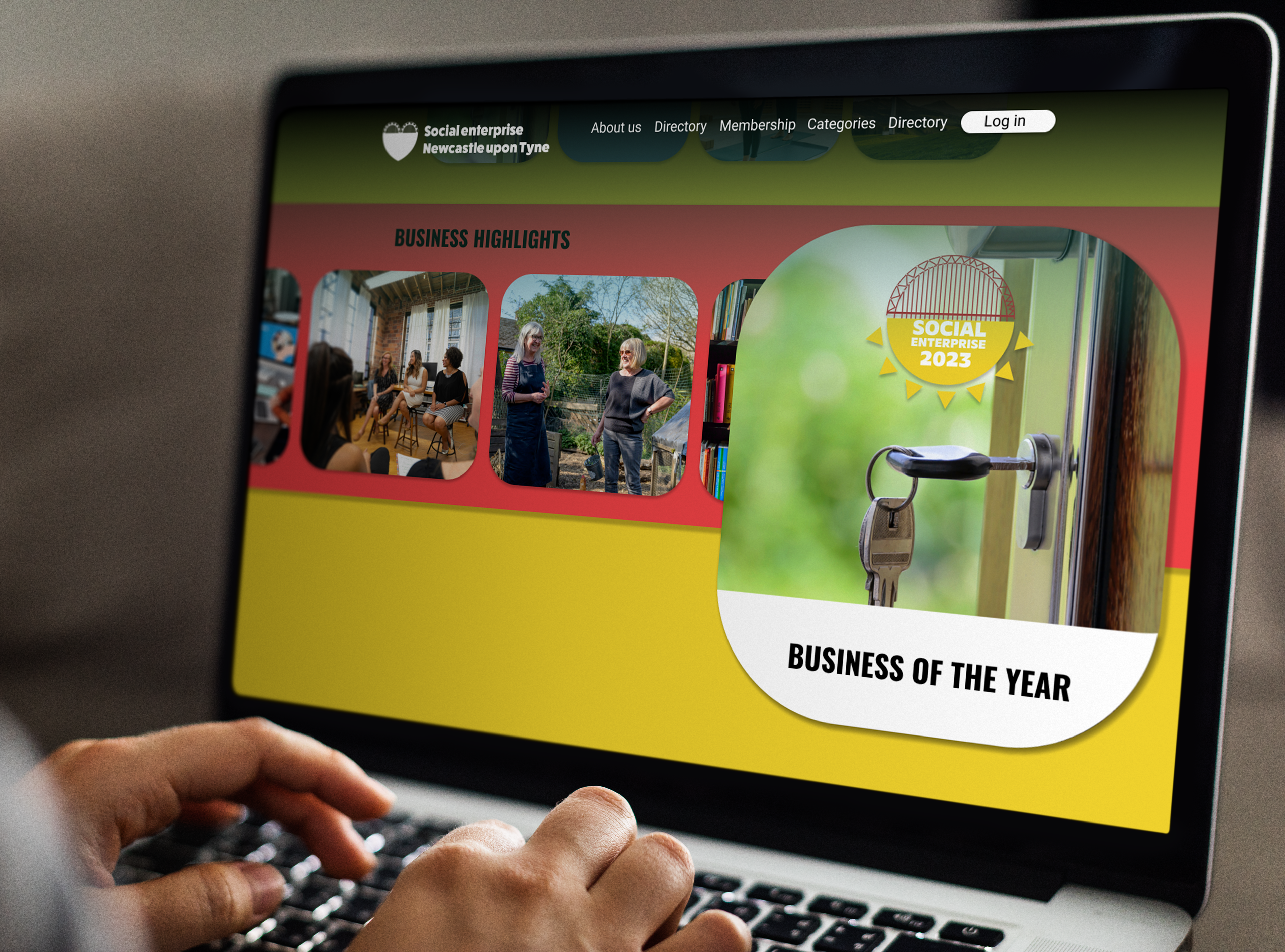
Early development and research
