Student Design Awards – Penguin 2021
Submission for adult non-fiction cover award
Development and research
CONCEPT:
In my proposal and treatment, I stated that I will work on a different book, in a completely different category. It was meant to be ‘Talking Turkeys’ written by Benjamin Zephaniah. I had to change my concept because after reading the book I realised that I am not the right person to illustrate its contents. A lot of inspiration for it was taken from reggae and rap culture and in my opinion, I do not have enough connections to it to be able to represent it accurately. That is why I changed the category. The book of my final choice was on my reading list anyway, and the subject of it which is so important and overlooked by most of society seems to be a perfect occasion to express my feelings.
The author of the book does not offer us a popular soft version of the possibilities of climate change. He presents facts, with no exaggeration, and those facts are enough to make us dread not only our children's future but ours.
I want to make the cover visually strong, interesting, and different. I am not planning on making a nice and friendly vision of Earth magically being back to its pre-industrial condition. I want to show ugliness, dirt and make it look good and interesting. Turpism is going back to favours. I started preparing a few sketches, including not-existing machines which are being operated by humans who
by abuse of them are killing the only environment in the known part of the universe we have. My intentions are to play on emotion and create a cover which creates a love/hate relationship because, in my opinion, that is what represents our situation the best.
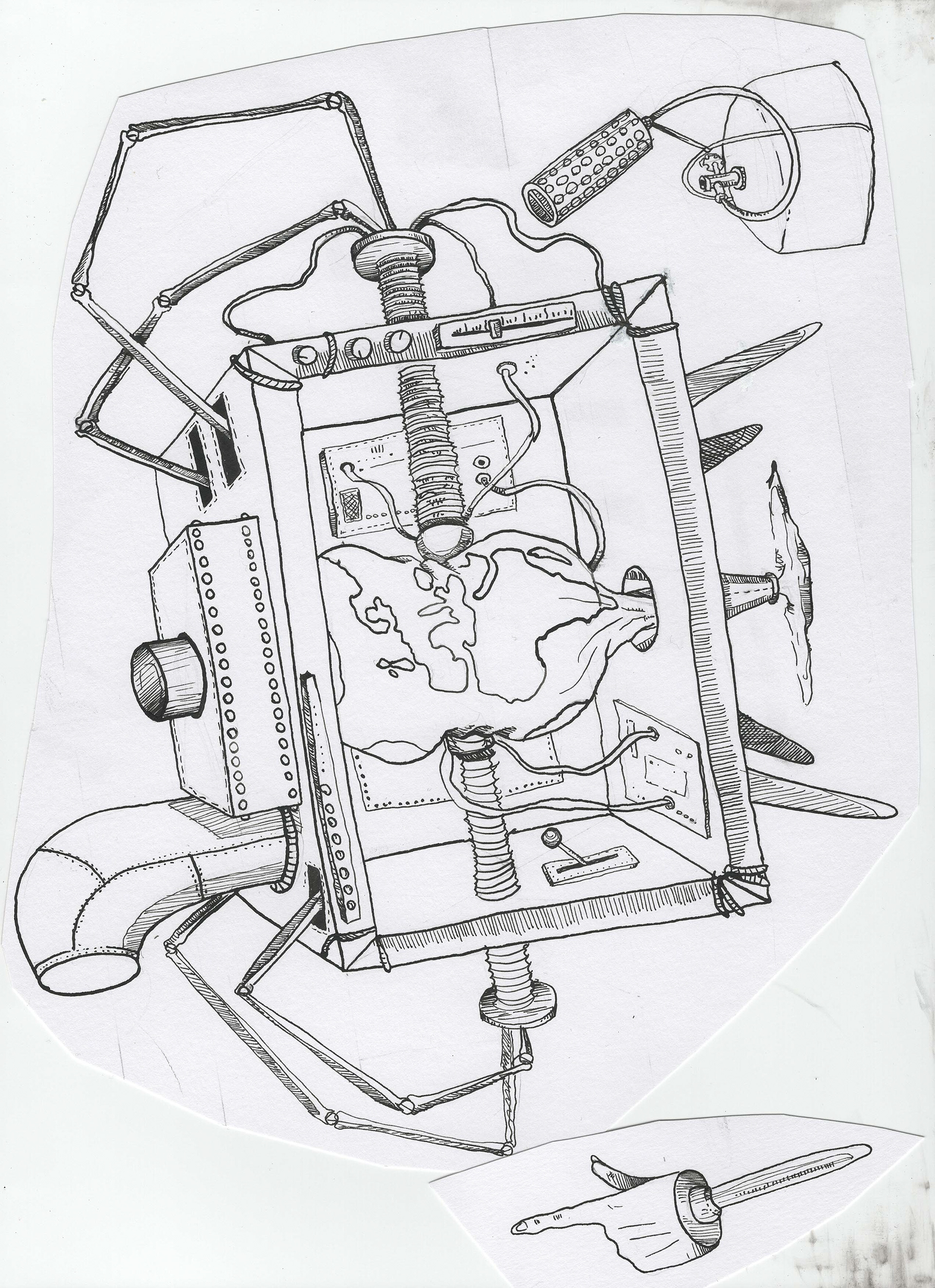
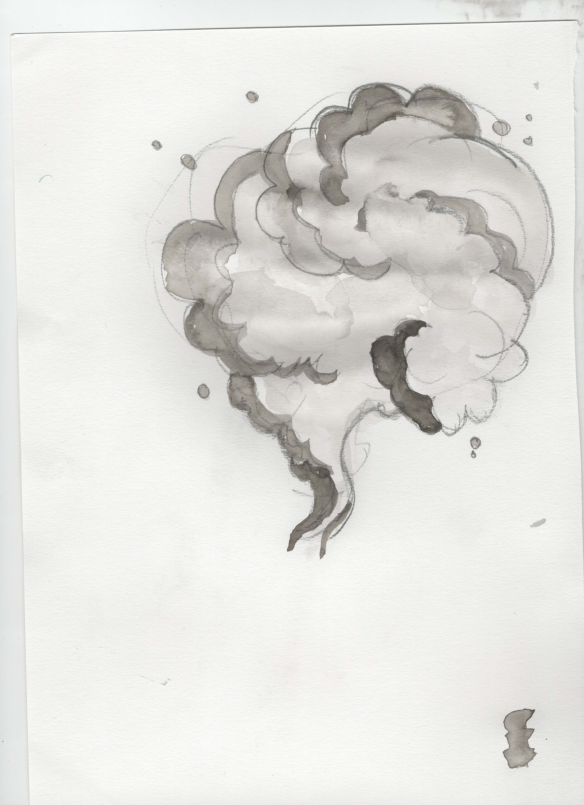
This time I will use traditional media – ink, watercolours, brusho and Derwent concrete-like paints I bought some time ago. I will separately scan line work for each element and combine it digitally afterwards. I was thinking long about typography and drawing the front cover and spine text is the best idea for this project. For the back cover, I will use standard penguin font – gill sans. The thumbnail I am the happiest about shows a human hand pressing a big red button attached to the machine. Inside a machine, there is earth, squished by parts of the machine, with water underneath and hurricanes above.
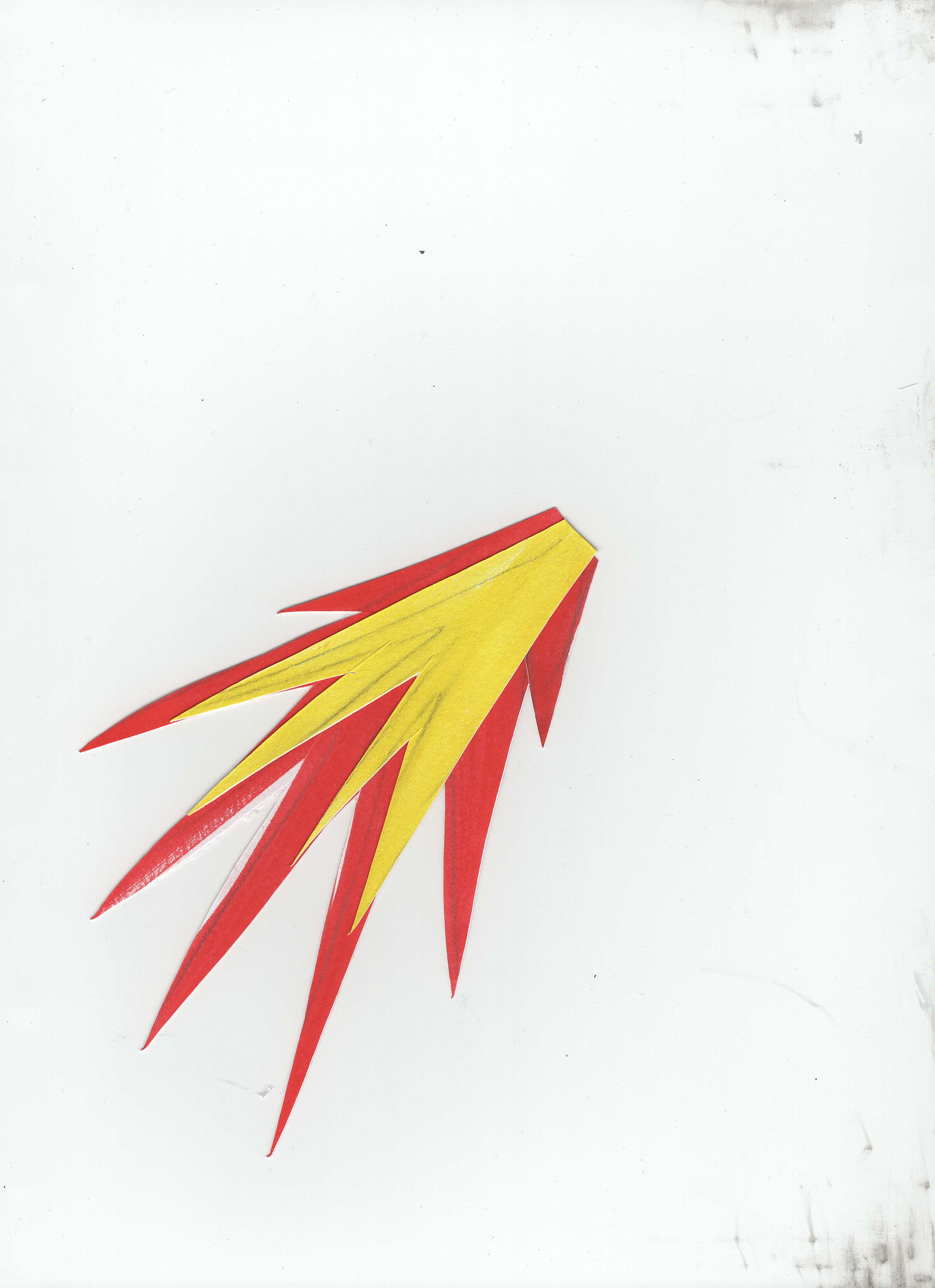
And there is a flame thrower too. On a machine, there is a cabinet with a thermometer showing high temperatures and a human skeleton in it. On the side, there are two mythological hybrids – sphinx and centaur.
And there is a flame thrower too. On a machine, there is a cabinet with a thermometer showing high temperatures and a human skeleton in it. On the side, there are two mythological hybrids – sphinx and centaur.
EVALUATION:
Out of a few projects I worked on this semester that was the easiest one and that was the one I felt the most comfortable in. That was the idea from the beginning – to have one of them within my comfort zone just so I can focus on developing others more and manage potential stress better.
The choice of the book (second, I have explained reasons why I changed it already) was brilliant. It was on my personal reading list for some time already and I believe we all should read it. While working on the cover I was trying to translate the feelings I am getting from the book into illustrations. I was confident about the concept.
I have researched a lot about copyrights while using fonts made by other creators – before I was always relying on the ones, I made. It gave me an incredible insight into future projects. I may be interested in using an already existing font for visual or practical reasons (deadlines).
While composing the cover I had a chance to refresh my knowledge of how to work using InDesign which will become one of my most used tools in the future. I provided a mock-up of how the book might look after printing so I can see exactly what I produced.


